It’s always referred to as the pinnacle of the Linux desktop because of its semi-annual releases, always being very up to date, and always incorporating the latest developments. If they are good enough.
GNOME 43, Linux Kernel 6.0, Pipewire – all very normal with Fedora.
Nevertheless, there were problems with the hardware, some of which could not be solved at all. Otherwise, many typical Linux problems hit us.
Since Fedora is very dependent on GNOME, i.e. the user interface, the test will also be very related to it.
Installation
The installation was actually quite ok for Fedora, the installer still has an idiosyncratic design, but I was able to install the system without major problems, encrypted on an external NVME SSD.
So doable for anyone with some experience.
Start
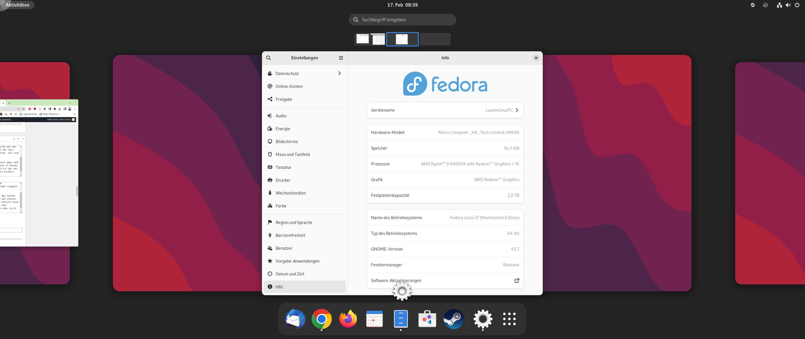
The first boot was then a bit of a surprise. The new PC has an AMD 6900HX CPU with a Radeon 680M iGPU, so it shouldn’t have any major problems with the current version.
But there was one problem, and it remained: the entire screen was over-sharpened. Every font was overly crisp and every edge unnecessarily sharp. So out of the box it was not exactly good, even if everything else ran smoothly.

I also had this with Ubuntu, but thought that Fedora with a newer kernel would already have a solution here. But no, unfortunately, the start was spoiled with it right away.
Design
The design of Fedora is, as always, very close to GNOME. This makes everything quite unspectacular, but also clear and yet modern.
A lot has been done here in the last few years, so Fedora 37 once again looks more modern than many other distributions, or even other systems that are not based on Linux.
It’s a pity that they don’t use user accent colors yet, as we know it from Ubuntu by now. Something GNOME-typical is also that one does not feel the user is important. Where others just offer accent colors and simply write the user now and then where, so in GNOME and thus Fedora, the user is rather someone third, from the feeling.
Apps
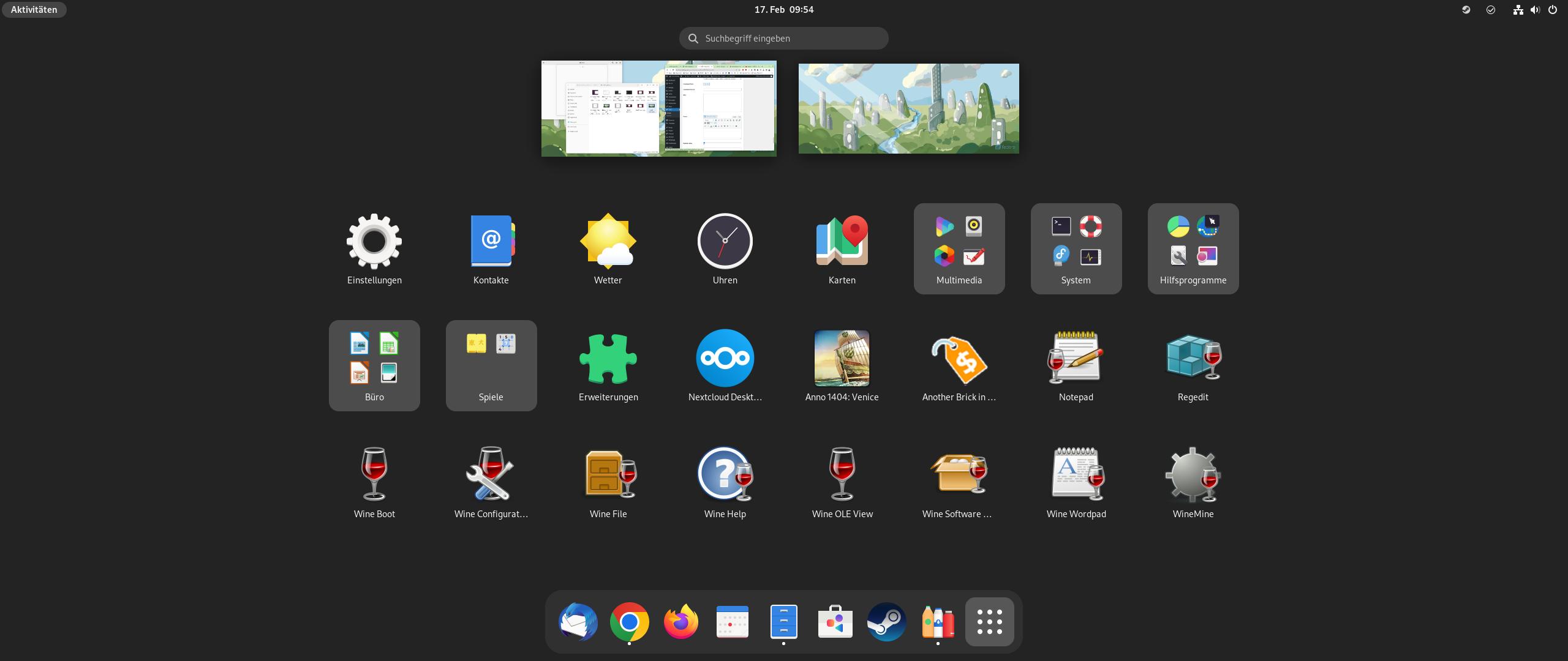
You will find a selection of the most necessary apps, including Thunderbird, Firefox and LibreOffice. With this you can already start working.
The Software Center is based on Flatpak, at least for most apps, but as far as I know, the entire Flatpak Store will only be completely opened with the next version.
This is actually a strange approach. You want to deliver a system for all, but prioritize free software. At the same time, the user is deprived of the simple possibility to install what he needs. Again, I don’t like that.
In addition, Zenkit apps are still missing as an example, but this is probably more due to the manufacturer of these apps, because only Snaps are supported. So still another annoying point, because you would actually also have to install Snaps to be able to use all apps I need.
Work
As always, the system should not cause any problems in everyday use, right?
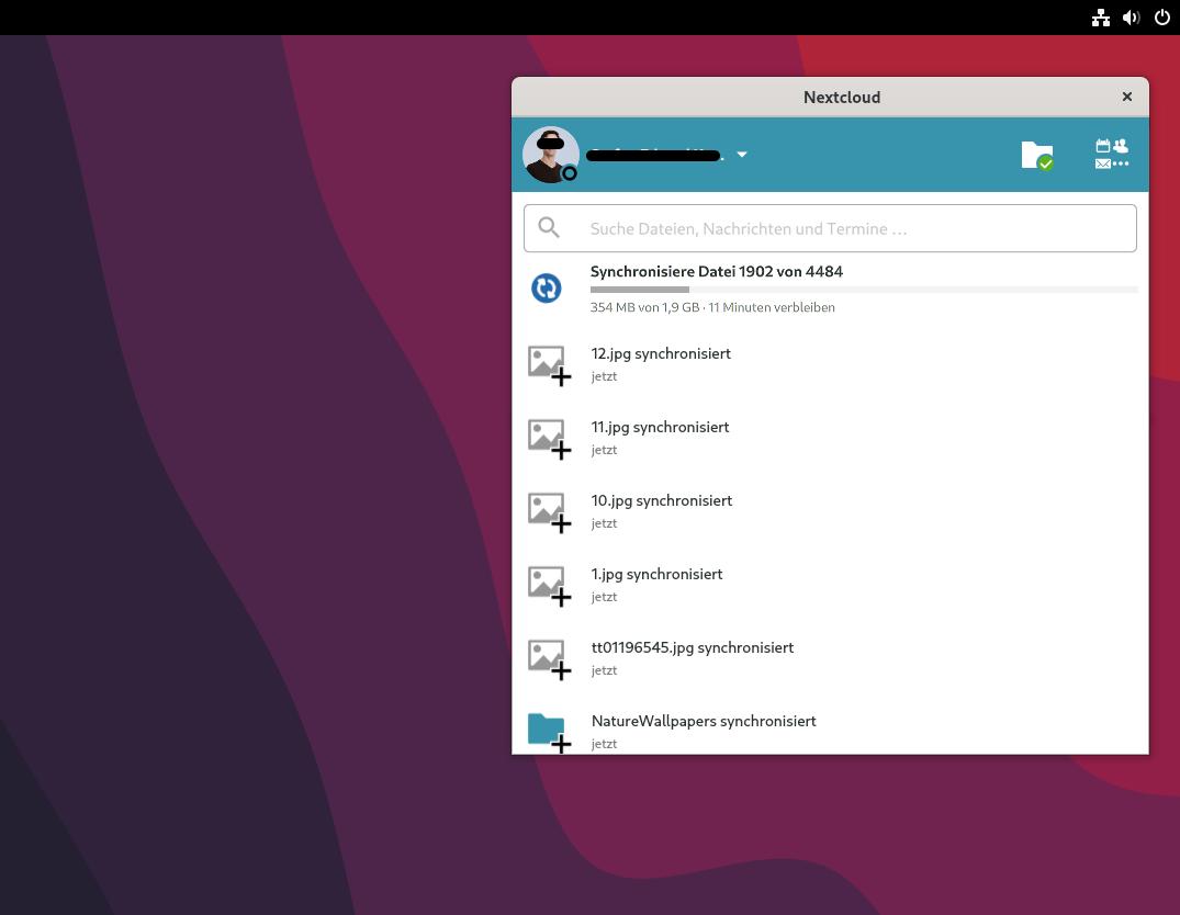
Nextcloud was found and installed in the Software Center right away, and even Chrome was quickly up and running.
But here it already started: You need the GNOME Extensions app, because otherwise no background apps are displayed via icons. Which the Nextcloud client obviously is. At least the AppIndicators were directly activatable. In the next GNOME version, however, this is addressed, albeit somewhat half-heartedly, as it seems to me.
Lately, GNOME has been stuffing everything into the system status in the upper right, with expansion menu and so on. So the solution to an old problem is, again, lots of clicking. Congratulations. Again, I guess you can’t pick whether the icons are permanently displayed at the top. Congratulations. Even shutting down takes an high amount of clicking, because you can’t be bothered to do anything better than another expansion menu. Unfortunately, this feels like forgetting something, or being too stubborn to implement something long before, but now compromising. Oh well.
The next fun thing, besides the already mentioned exaggerated sharpness of the display of the whole system, was that in Chrome the colors were all washed out. Where apparently not from the content, but Chrome ansich. Icons, or the red marks under a misspelled word, which thus look rather old-fashioned. No solution here.
Long mouse paths and unnecessarily many mouse clicks are unfortunately just as annoying, as that you can not simply minimize windows. For GNOME there is a key combination (Super+H), but Fedora saves the minimize key for the windows. So you often find yourself right-clicking on the apps, and then clicking minimize. Is this really what the inventor intended? It rather seems as if people who are not as experienced at the keyboard are disadvantaged. Why? Because you want to look minimalistic? Because one finds the desktop computer stupid? I don’t know. Here I did a little test with a first-time Fedora user who knows Windows pretty well. And yes, one was very quickly annoyed and the lack of understanding was also great, because you just use minimize often.
But here you have to say clearly: I like the concept of GNOME, minimalism can be something wonderful. Ignoring or not accepting how people use systems in everyday life, has nothing more to do with it. So again just lack of understanding and also quite clear why Ubuntu is improving here. Fedora and GNOME destroy the usability here, thus also the productivity. And no one would come up with the key combination on their own.
Working is as always quite good, but many little things make life unnecessarily difficult.
Desktop
As mentioned more than once, the desktop is still a bit annoying to use.
This is mainly due to the simple fact that the Dash, i.e. where my favorite apps are, is at the bottom of the screen. You have to open the Dash first, though, which is best done with the Super/Windows key. With the mouse only, that means using Hot-Corner, or clicking on Activities. Both at the very top left.
So most of the time I have to use the mouse to go all the way to the top left first, then all the way down to the center. On a 29 inch monitor in 21:9, this is a lot of fun when you have a lot to do and just seems incredibly cumbersome.
So here again the criticism that apparently GNOME still does not care too much about the normal desktop.
There is no fade-in dock, it can only be at the bottom, you can not trigger and open the Dash with the mouse at the bottom of the screen.
Please dear developers: try to use the system only with the mouse and finally give the desktop with large monitors some time and love. After all, this is your main place of use, but you don’t seem to realize that.
GNOME is one of the two major desktop shells available for Linux, possibly even the most used. And what do they focus on? Tablets and more recently, smartphones? Touchscreens and finger control? Just a little tip: Know your audience. I’m sure 99% use desktops and laptops.
Windows-Apps
In short: question marks. Fedora can’t do anything with an EXE file, at least by default.
In the Software Center you can at least find the “Wine Windows Program Launcher”, which sounds promising. Once installed, the system at least reacts differently, EXE files are at least tried to be opened. But also rather tried.
Conclusio
Mixed feelings and typical Linux hiccups. Fedora 37 unfortunately leaves a taste of unusability in the long run.
And yes: much of this is not unique to Fedora.
Times what was not so good:
– Exaggeratedly sharp image over the whole system, probably because of “newer” 400+ days AMD processor and iGPU (6900HX)
– WINE and Bottles were not really useful
– Monitor standby could only be ended by switching the monitor off and on completely
– Usability on the desktop still bad, if you don’t want to/can’t use the keyboard all the time or know how to do it
– No app indicators for background programs
– No possibility to always show the dash as dock, to move it or to change it at all
– Minimizing apps very cumbersome, often leads to many open programs which hurts the overview and thus usability
– Often unnecessarily long mouse paths
– Often unnecessarily many clicks
– System very keyboard oriented, not always ideal for laymen, hardly explained and should not be required in principle
– System on the desktop apparently little optimized, or no interest in it
– If you open an app that is already open on another desktop, a hint is displayed, but you have to click on it to get to it
– The app menu is messy stuffed with all apps – you don’t use the folders from the start
– No accent colors, also little focus on the actual user
As is often the case lately with Linux distributions, with GNOME, and by extension Fedora, you get the feeling that on the one hand something is going on, but on the other hand not enough.
What makes it exhausting is the fact that so much is done well and correctly, the many little things that do not work, but ruin everything.
One has the feeling that the developers do not use their own system, do not listen to the simple user or ignore him, development goals are not chosen in the direction, there is too little manpower in development, or simply little interest to improve the classic desktop, because that is in contrast to real innovations, boring. I would really like some feedback on this!
Unfortunately, it’s clear this time, the system is hard to recommend. This may also be due to the “new” hardware, even though the AMD Ryzen 9 6900HX is already 400+ days old during the test. On Ubuntu, there were similar problems with the display.
So: Hardware support unfortunately not so good, GNOME on the desktop still only “okay” and many Linux/GGNOME-typical little things, make life unnecessarily difficult.
Unfortunately, it still needs a lot to become good. However, it is still far away from very good then.
Would like to see a fundraiser for GNOME, so that here, similar to Thunderbird, can finally make up more ground