In the Distrowatch list, KDE neon scratches the top 10 and is an interesting candidate based on Ubuntu 20.04 LTS and with KDE that is always up to date.
At first glance, it is a system that is somewhat reminiscent of the old Windows days, which comes with a partly good, partly questionable design and has always been the big competitor to GNOME. At least as long as I can remember. I came into contact with KDE for the first time with openSuse over 15 years ago.
At the start of the test there was a decent delay of about two weeks because I was waiting for the 5.21 update.
Installation
As is so often the case, one can assume that laypeople will not be able to cope with it – but overall there were no problems with getting the system onto the laptop.
Start
The first start was the second start because I was waiting for the big update. The system is once again quite nimble, the login screen is still rather minimalistic – with the current version you can switch to Wayland for the first time “reasonable” if all programs would play along. LibreOffice as an example not.
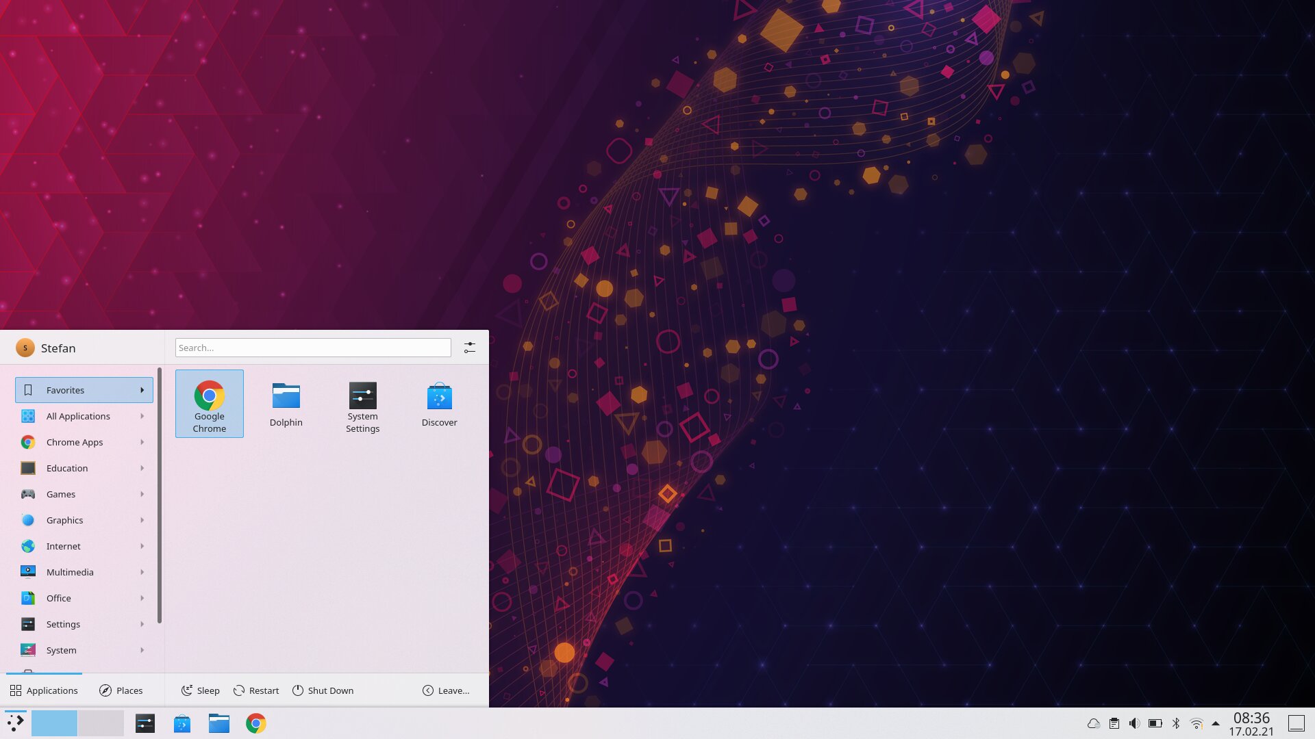
The blank screen after logging in doesn’t reveal much, but is clearly reminiscent of Windows when it comes to the division of the elements. The launcher menu has been completely redesigned in the new version, which has the advantage that programs and places, i.e. file locations, are displayed separately. On the one hand this is clear, on the other hand it continues right next to it with “Sleep”, “Restart” and “Shut Down”, which is done in the same design and has already invited me to click inadvertently.
After all, you can quickly find the apps you need and the settings should also be easy to find. At the bottom right you can find the clock, behind it with a click, the unadorned and quite functionless calendar. Apparently it cannot display more than days.
If you click through the system and look at all sorts of things, you will notice that this is often the opposite of what many other modern systems are. Minimalism and a predefined selection are available, but apparently the system want to give the user a lot of modification options.
For me, there is already a thought here: That you could deal with the system more than you should as a user. Or would like.
I also had to turn the screen dimming up from two minutes, because I found it very annoying that the monitor always gets darker and the touchpad was not set to tab-to-click again. So much for the first start.
Design
As already mentioned, we are operating on a Windows-like level and a design language that has been improved in the current version, but still needs some getting used to at the beginning. Everything is beautifully light and actually structured, but the thin lines, narrow fonts and often only marginally demarcated backgrounds as an example give you a not completely round, or better, finished feeling.
With other distributions you get the impression that everything comes from a single source. It’s basically the same here – but at the same time there are always elements or small things that in turn cloud the appearance.
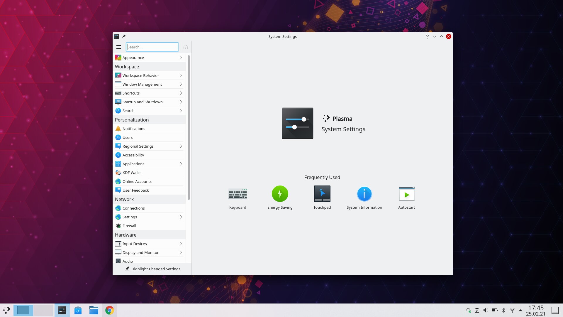
If you open the system settings (which are quite confusing and cluttered anyway), you will find the system settings icon in the header, which is quite useless, and then a pin that is there to display windows on every workspace (which is certainly extreeeemely often used and therefore cannot be stored in the right-click menu) and next to the Maximize, Minimize and Close window is a question mark – which should help, but does not do that in this case. In short: in the header alone, the design and minimalism, as well as the quick overview, are destroyed by placing unnecessary amounts.
Furthermore, one almost has to say that the icons no longer serve the necessary purpose – because they mainly look thrown together. There seems to be little in common (the sizes of the depicted elements often differ from one another, at least visually). In the settings alone there are a number of icons that, for example the keyboard, are not always recognizable or assignable at first glance. It is possible that the icons simply have too much detail to work in smaller representations.
You also have the feeling that you are using an earlier version of KDE, possibly because they haven’t changed that much. At least that’s my feeling behind it. But even in the new launcher, the line up of icons is so small that with multimedia as an example, it is difficult to recognize a monitor. This is of course due to the gray drawn monitor stand, which almost merges with the background. In the file explorer there are gray icons, as well as in the shutdown menu – this may also cause unnecessary optical confusion.
As I said, the fonts are often too thin, the font sizes also seem to vary and make the overall picture a bit nervous. Basically, I would say that the basic design certainly has potential – but it looks too much like “hobbyist Linux”, even if that may simply be desired. Or you carry old burdens with you and you prefer to move forward with your current strengths and users. New users have a harder time.
Apps
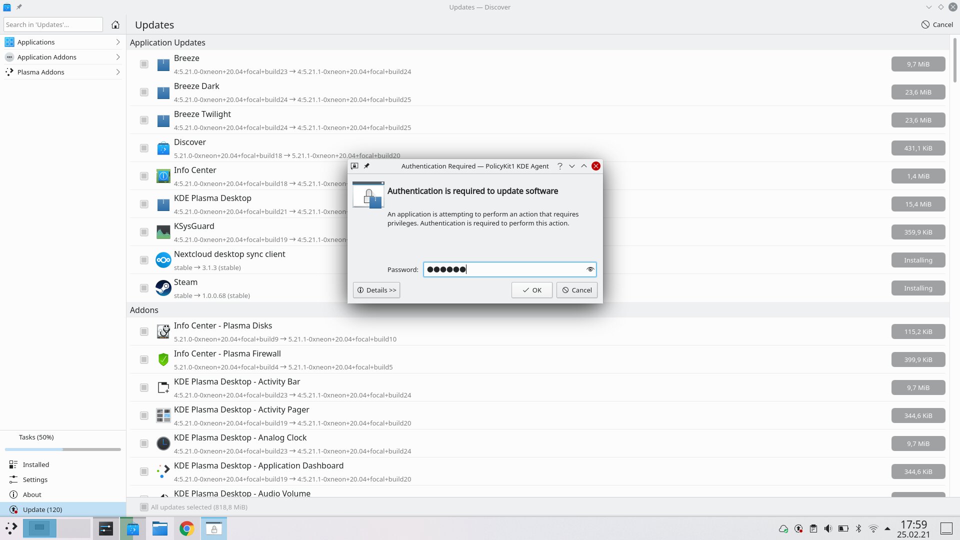
The basic software is quite marginal, not even LibreOffice is pre-installed. But shouldn’t be a problem – that’s what the store is for, or Discover, as it calls itself. As is so often the case, you can also do software updates in this, but you have to admit that the “experience” in the store lags far behind others. Even in the Linux desktop comparison. You have a search and the most important things are there, but anyone expecting a modern store will be disappointed. Functional, but not much more, unfortunately.
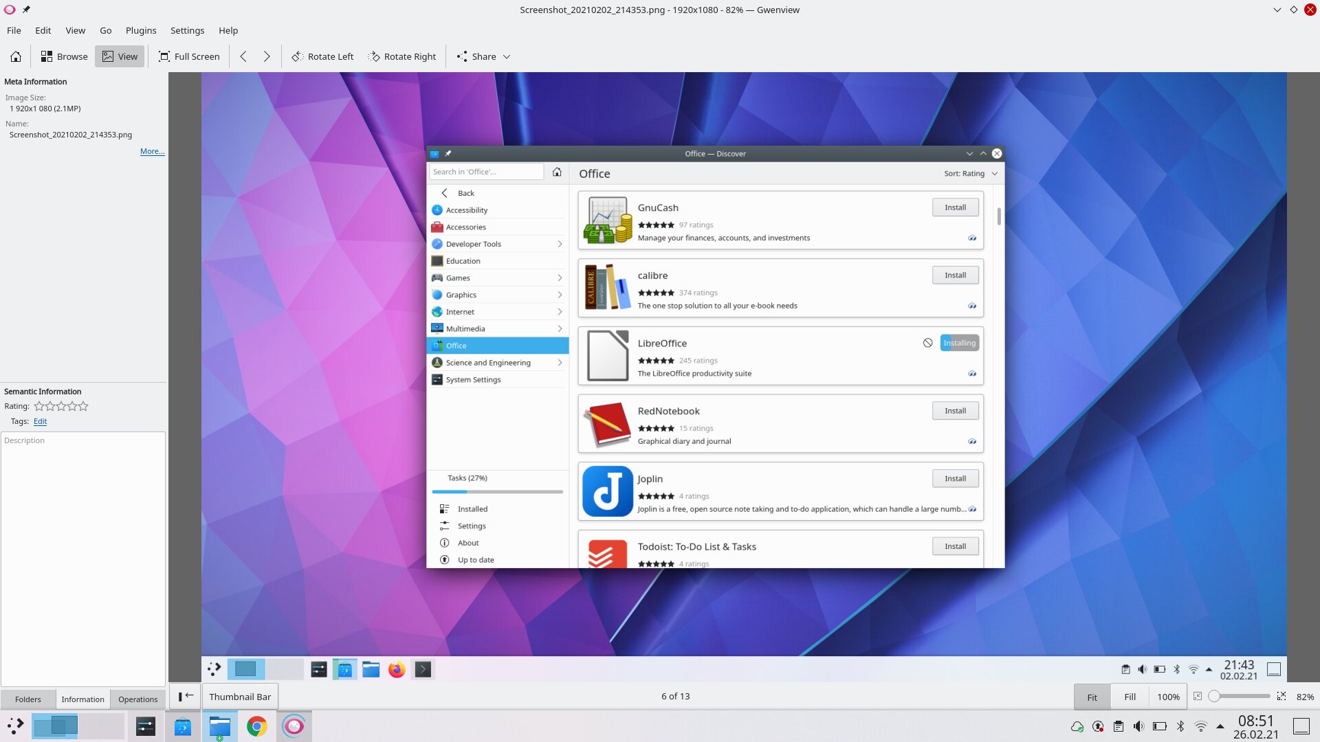
In general, almost everything important can be installed thanks to flatpacks and snaps, and the versions are also very up-to-date. As always, the file size has increased accordingly. But yes, my most important programs are all there and run like in most other distributions. VLC, Atom, Zenkit, Blender, Nexcloud Client from the store are no problem – Chrome was also quickly installed by hand and everything works.
Work
KDE neon actually receives updates to KDE on release day, which I was able to experience on February 16 – right on time with the 5.21 update. That’s a nice departure from the stubborn 6-month cycle of most distributions based on GNOME. On the other hand, it robs the user of the freedom to stay with older systems.
If you have the system on your laptop for a few weeks, you quickly begin to get used to everything. But – get used to? In this sense, the system does not offer any new ways or special functions. Everything looks old-fashioned and probably is in the heart too. Especially if you come from the Windows world you will hardly be surprised, I can even imagine that some people are attracted to the start menu because it is more like the old Windows systems than the new one.
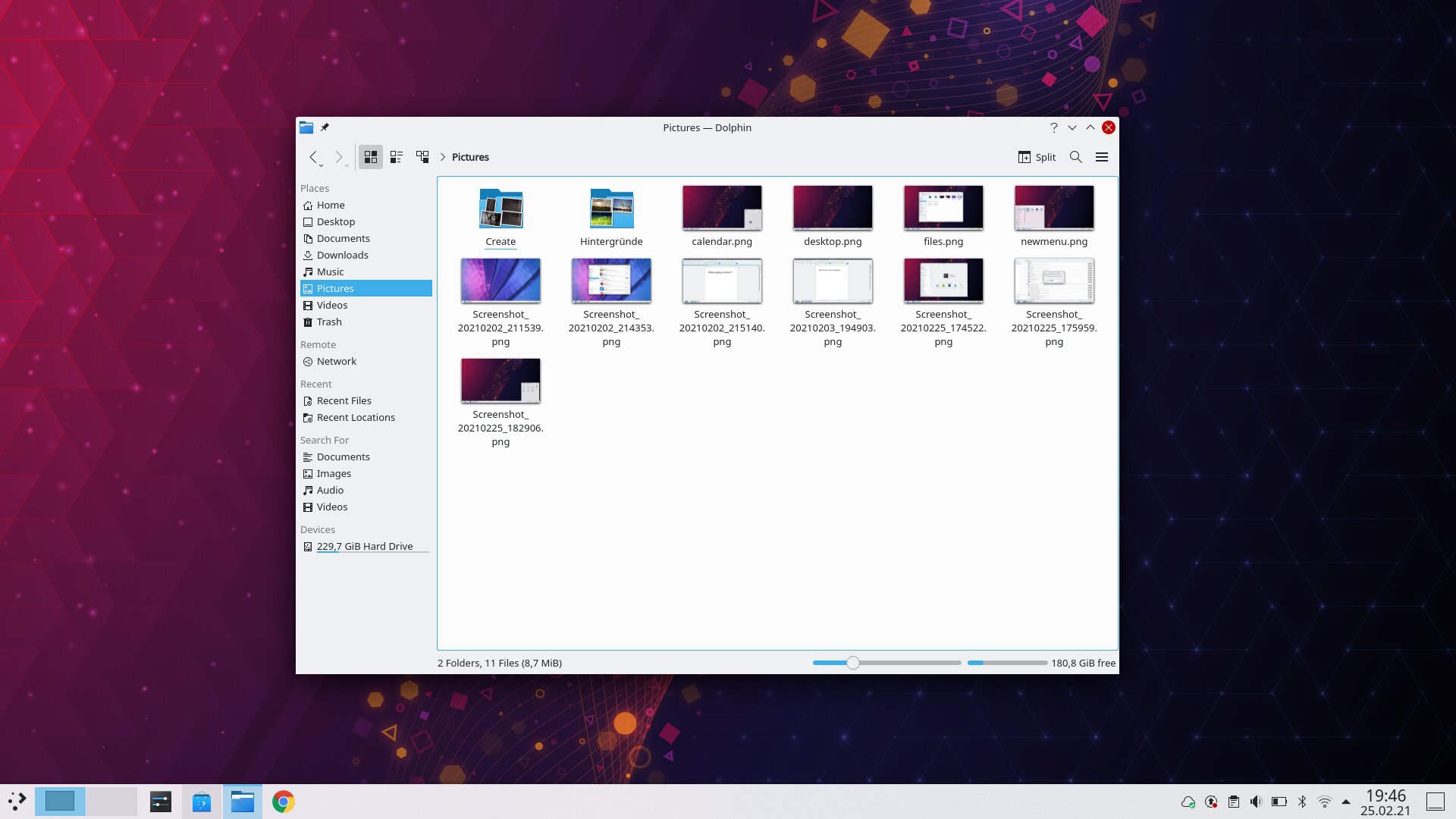
The file browser called Dolphin offers everything you need- works like a mixture of typical Linux and typical Windows file explorer. Personally, I found the “one click to open” setting to be annoying. As soon as you click something in Dolphin, it opens. This is quite unique that I like to do without, because, especially when used to other systems, one clicks annoyed on “Back” or closes the corresponding file. But it is a matter of getting used to.
The new start menu is just as functional, but nothing special either. After all, you get it here that you feel the user is important enough that he or she is findes the name in the start menu. I think that is lacking in many of them.
Window snapping, i.e. simply maximizing windows on the left or right side of the desktop, also works with quarters – and also in the upper and lower halves, which is useful with turned up monitors. Either with the mouse, or with the Super / Windows key and the arrow keys.
Something like the activity overview or the “open window overview” as most systems have today, could only be found using the key combination Ctrl + F9 or F10, which lists all windows or only the windows of the current desktop. Again, this is a good example of how the system is designed – instead of one selection, you have several, but it is also more difficult to use. I would never have found this without help. Other systems with the Super / Windows key are better positioned in terms of practicality. Gestures on the touchpad would be the dream again. For this we have a very present “Show Desktop” button, which I have probably already used seven times in real life. A total of.
Switching with Alt + Tab works well as in any system, but the quick change and possibly working on the laptop itself turns out to be more difficult, because the necessary little things are missing. So you often have to fight your way through with the mouse or use the often unpractical key combinations. GNOME is definitely one step ahead, for example.
Multimedia
The photo viewer with the simple name “Gwenview” has proven to be of little use. On the one hand not a real photo viewer, on the other hand not a real photo management either, it offers at least (not immediately obvious) editing functions that cover at least the minimum. What I like is a resize function, so you can save photos in new resolutions. Overall okay, but the handling takes a bit of getting used to and is complicated.
Video and audio files were more of a question mark to the system without the VLC player. So possibly no support out-of-the-box at all.
Windows-Apps
Wine was installed quickly via the software center and I was able to open my test EXE immediately – that was pleasantly easy and that’s how it should be.
Games
As usual, you fight your way through a few battles with Steam and some games from the software center, Ubuntu and the Linux kernel as the basis and Steam with Proton – as always, there are no special features of what’s going on. Stupid said.
Conclusio
KDE neon leaves a divided impression. On the one hand, the system is old-fashioned enough that anyone who has used Windows in the past 20 years will find their way around. On the other hand, that is a shame, because there is not much space for new concepts.
Since you have to assume that this is exactly what the system wants, a recommendation for beginners is often only conditionally pronounced. Because the system is aimed more at people who like to work with the system – there are often a number of setting options in all areas.
The basic installation also speaks in favor of this – because everyday life cannot really be mastered without additional software. No videos, no music, no office, no email program. In short, you have to know what you need and get it from the rudimentary software center. This is of course fine for advanced users, but hardly an option for newbies, especially when switching from large systems. But “kubuntu” from the Ubuntu line should provide a remedy, which comes with a software package.
The design, the functions and the handling are more a matter of opinion for each individual. It doesn’t have to mean either good or bad, but the system is nothing for beginners. Again, you miss comfort functions, the design looks good in the base, but often confusing overall.
The software is hardly available and even if KDE neon is all in all usable, it is more for people who want to build on a more traditional system that can be changed at every corner just for fun. That particular is rather useless for the simple user, but above all because one would rather deal with content than with the system.