Ubuntu was released on time in the LTS version and offers all sorts of new and interesting things. We take a realistic look at it.
With every LTS version there is a lot of responsibility – because an LTS version is maintained for at least 5 years (ESM even 10 years), however after two years there is a new LTS version. Since this is the version recommended for productivity, the release is of course more important than the intermediate versions.
It seems that some of the topics of the past few years have now culminated in this LTS version and it feels like a new chapter. The surface is very polished and with Yaru as a theme, it also looks chic. Furthermore, snaps were further favored as an installation package, a more current kernel was implemented and there are of course a lot of innovations under the hood that are not really important for the simple user.
How these changes are perceived by the user -this is interesting. And we want to take a look and report on that.
Installation
At the beginning there is always the installation. This is hardly feasible for absolute laymen, since you have to create a USB stick, then boot it, of course save data beforehand and then transfer it. There should be a expert, or you have to deal with it for a while.
The installation itself is not very complicated, you can also just go to live mode, play around and see if you can get along with the system and the system with your hardware. The second is usually the case anyway.
In my case, I simply delete the hard drive completely and install fresh and new – no old loads wanted. This can be done quickly on a laptop, which will soon be five years old, and you will quickly have a working system. ZFS sounds interesting, but is still being left out.
Start
Thanks to the SSD, the start is always fast anyway, this version is even a bit faster – which you maybe doesn’t feel anymore. When reinstalling on a laptop, the manufacturer’s logo is now usually displayed in the middle – Ubuntu underneath – everything on black. I like that and even more so the hardware manufacturer. That’s a good thing because it makes it easier to persuade various manufacturers to preinstall Ubuntu.
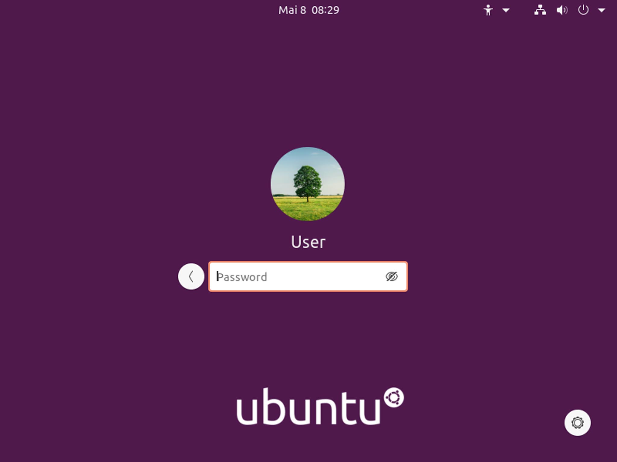
Then you select your previously created user, enter your password and you’re ready to go. The new login screen is finally more modern and functional.
You can also switch to the Wayland display server if you want to. Personally, I find it rather disappointing that the entire industry and community is still so reluctant to use a clearly more modern and already mature product, instead keeping X11 a 30-year-old standard alive. A clear leap would be desirable so that developers have to follow.
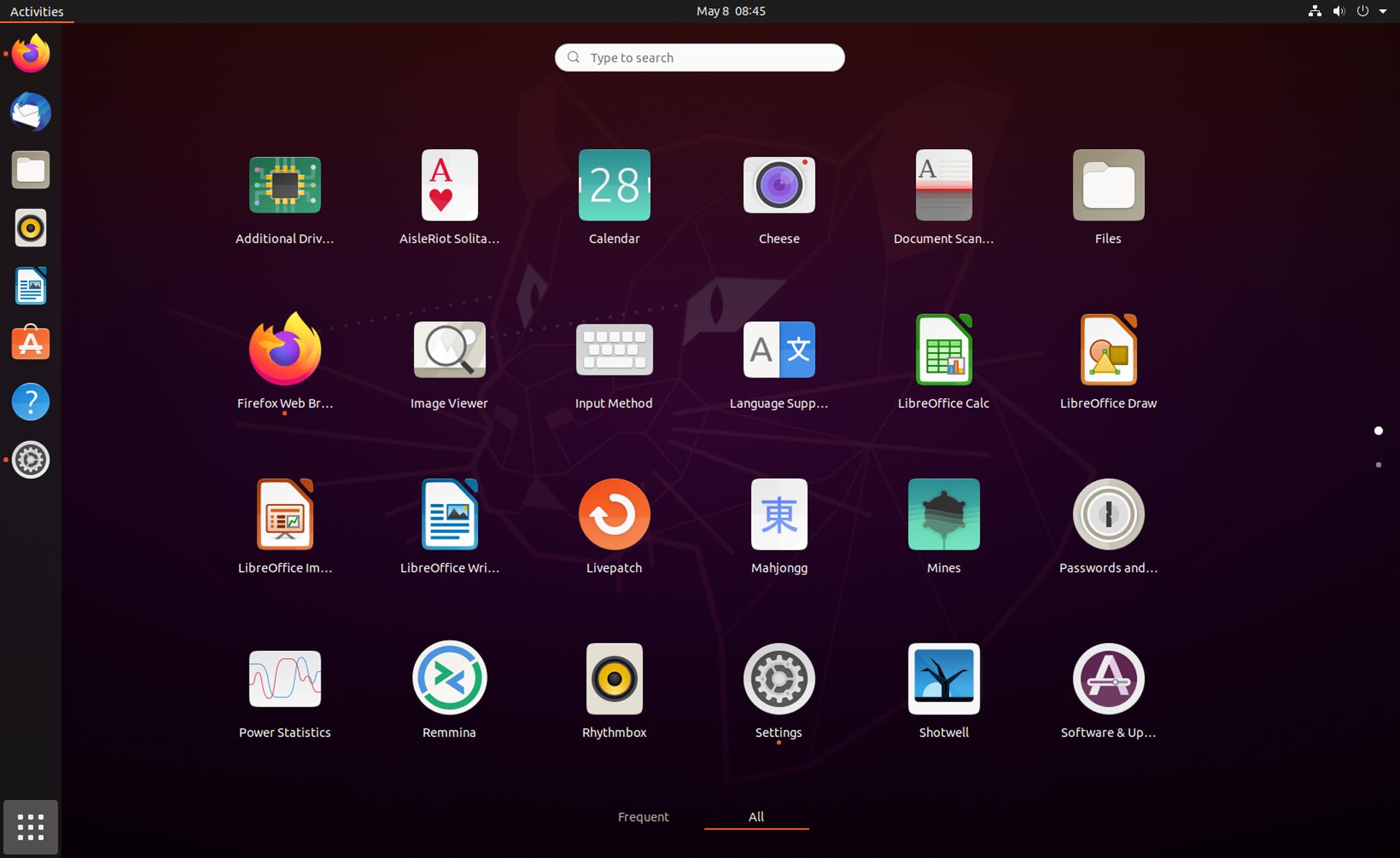
After logging in there is only an empty desktop with a mascot, next to it the dock with important app shortcuts. It doesn’t need more, because you can get started. At the top right you can take care of a WLAN connection and then surf with Firefox. Or transfer data. Or write something in LibreOffice.
The dock on the left has been standard on Ubuntu for years, which is also very good, since most new users without a special background would not see through the “activities” concept of GNOME on first use. This way you can keep an eye on important apps, the app launcher with its icon at the bottom left, you can guess from other systems. With GNOME itself you need two clicks to see the apps. Not that good.
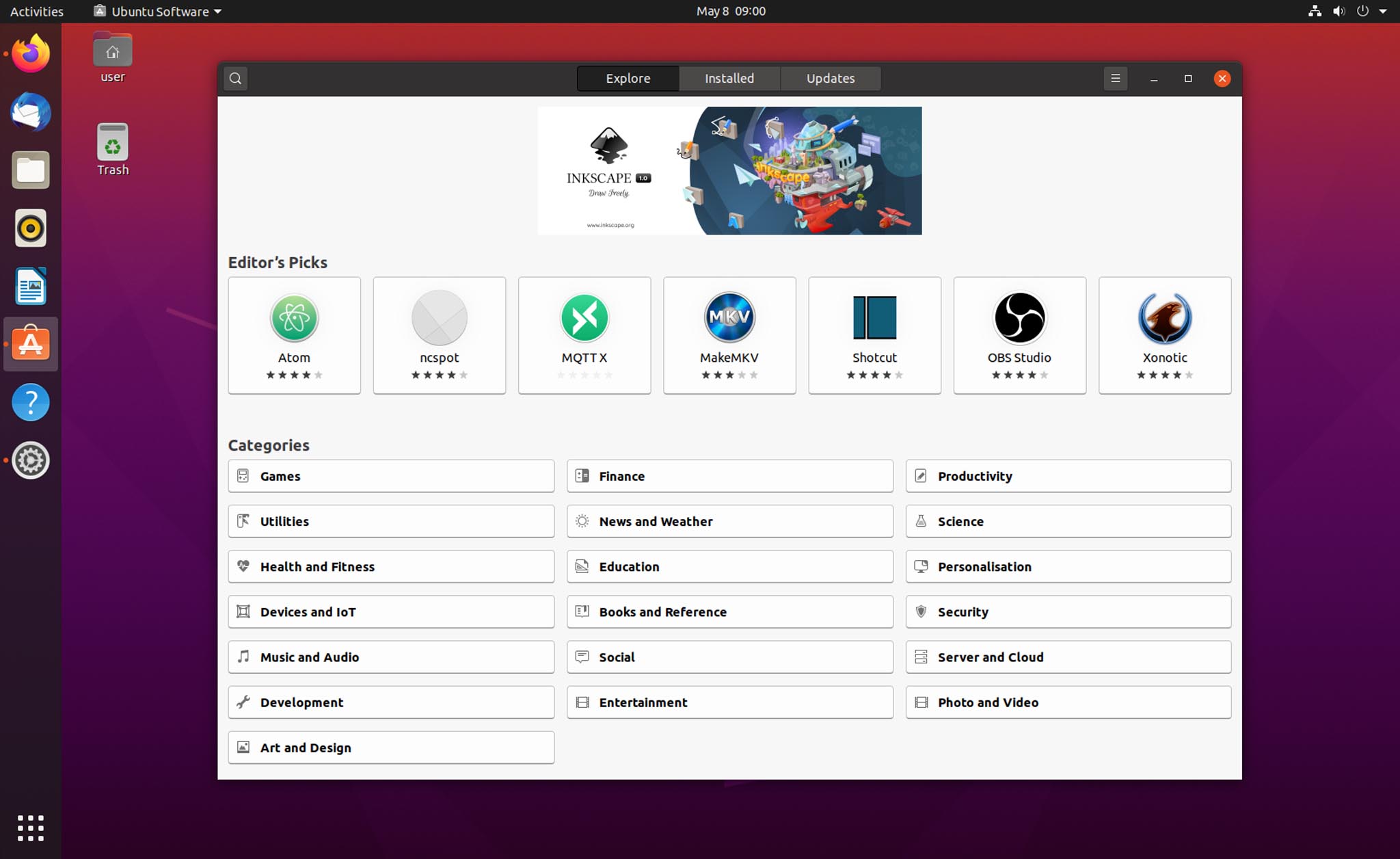
If you are looking for something that is not preinstalled, there is ‘Ubuntu Software’. This is now a snap app – which no normal person will notice – but is of course hotly debated. As long as it works, it doesn’t really matter how. In short, snaps are programs that come in packages rather than individual files. This makes updates easier and more flexible, and they run more securely because they can be better isolated from the system. Many whine about the start times of apps in the snap format – I can only confirm that when I start for the first time, because I usually keep it within limits. Maybe the community shouldn’t always use only basement computers and virtual machines. My average Intel i5 laptop with 8GB RAM from 2015 copes wonderfully with it.
Although ‘Ubuntu Software’ doesn’t seem to be developed to the end, I’m sure that the team will take care of it extensively. Generally speaking, ‘Ubuntu Software’, the ‘Snap Store’ or ‘GNOME Software’ – which all has the same basis – is still far from being as good as the competition from larger OS manufacturers.
If I search for ‘office’, I get 15 entries that have nothing to do with Office – so there is something wrong with the search. If I am in an app subpage in the store, the navigation bar disappears in my head and I have to click ‘Back’ first to get back to the main menu. There is also no quick selection in the form of an example of a dropdown menu with the categories. He was never the fastest either. There is a lot of room for improvement. Please let others influence you. This is not intuitive and extensive enough.
Furthermore, it should be said that an extremely large number of apps in the store are not checked. Possibly none, which fits the open source principle. However, this means that apps often have cryptic names, strange version numbers, do not run under Wayland and are often simply not developed further. I would personally like to see stricter handling – because what good is lots of choice if it is of poor quality? At least a mark with “Hey, the app has not been updated in 5 years” or “Wayland support doesn’t exist with the app, sorry” would have saved me a headache or two.
Then there are nice examples of the bigger apps and programs, like the recently released Inkscape 1.0. There is a snap, even pre-release versions to choose if you want, a normal name, screenshot, description and reviews. This is what a store app should look like. Quality not quantity. Cumbersome: as soon as you have installed the program, you have to go to the launcher to start it, since the store only shows two buttons with remove and permissions. Well.
After all, the permissions are now generally adjustable for every app, but even here the simple lack of interest of some hobby developers may be large enough that some apps will never use this.
In addition, it is somewhat peculiar to install software such as Davinci Resolve. After registration, the free version of the software can be used, also available for Linux and quickly installed. But: the software does not start on my laptop. Not tragic, then we’ll remove it. Under Settings and Apps – no. Here you can open the app in Ubuntu software, but it only spits out an error. The program is also not installed under installed apps. So how can I remove it? The solution is to uninstall the whole thing using the downloaded installer. If you have deleted it, which can be the case after a while, I don’t know how to remove the program – as a normal user. I can imagine. Not exactly user-friendly and also for manufacturers like Blackmagic Design, who offer Davinci Resolve, another reason to continue to treat the system neglected. A snap would be a miracle, but probably not compatible with the registration.
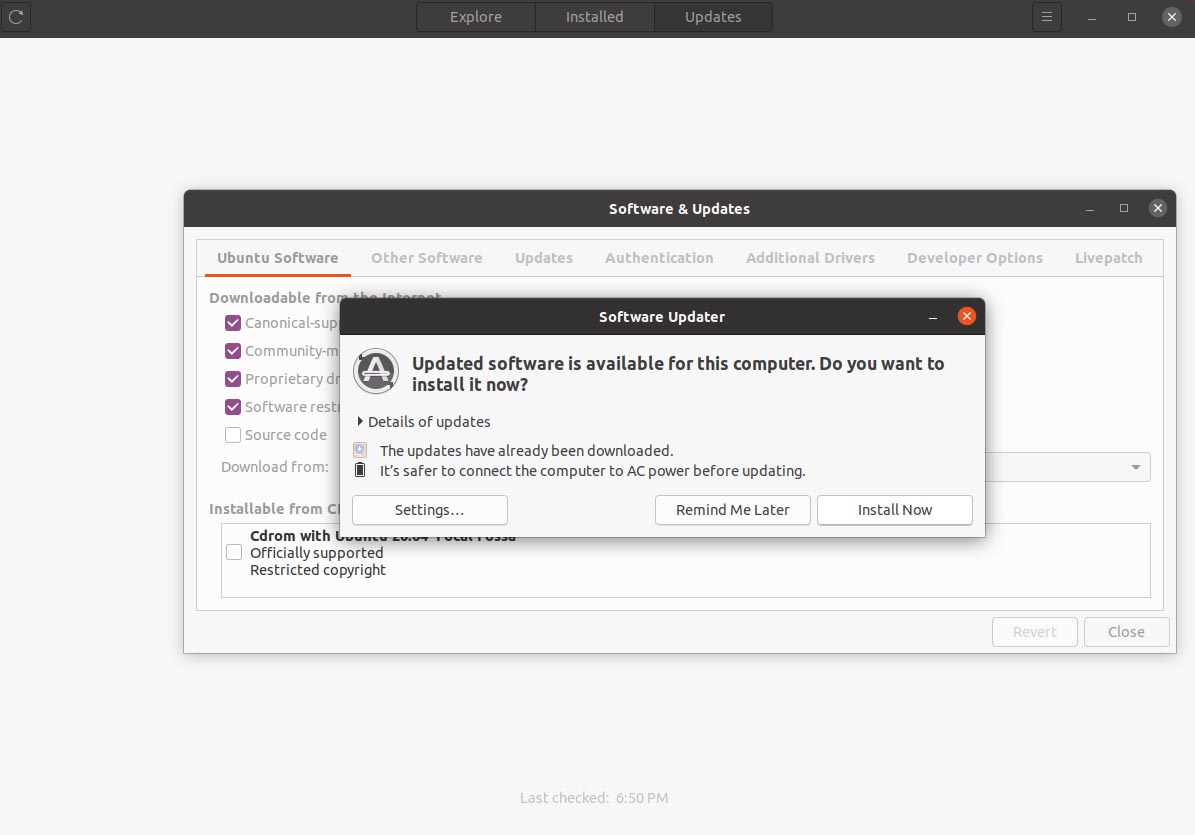
One more word about updates: Funny. If you don’t care, updates are generally done in the background. I think that’s fine, because a layperson doesn’t want to and shouldn’t worry about it. But then it becomes confusing. Because one assumes that ‘Ubuntu Software’ does it. There is a tab with updates where you can do it. Then there is also a separate program with which you can also do it – which can also be used to make major system version updates. And then there is a very similarly named program that manages the software sources and other settings, which would also be better placed in the system settings. Overall just not very consistent.
Design
GNOME is the name of the project and the interface on which Ubuntu and others are based. It is very usable, it has also become much faster and saves resources. Unfortunately, there are still many problems. The development is also proceeding more slowly than with the competition. This is of course due to the fact that it is a donation-financed project, which unfortunately cannot be an excuse – because the competition is there and very strong.
The general orientation is somewhat confusing. At the time, apparently, tablets were seen as a new form factor and said: We’ll be there. But instead of incorporating a new form factor, you simply threw the classic desktop over board. And then you rowed back and adjusted a lot to work on your desktop again.
Responsive design is really not a problem these days, but you also have to know how to implement it. So different modes for desktop, laptop, tablet and smartphone would certainly be possible. One with dock, touchscreen gestures, larger and smaller icons, etc. But you still think you have a tablet system in front of you that was half-heartedly developed and then repaired.
Why can’t you basically display the dock? So why are things like ‘activities’ too small for touch screens? Do you even want to be a tablet system or a reasonable desktop system first? You should really think about it, because it doesn’t look like one or the other. And it wouldn’t take too much to be something. You just have to make a decision and follow the path.
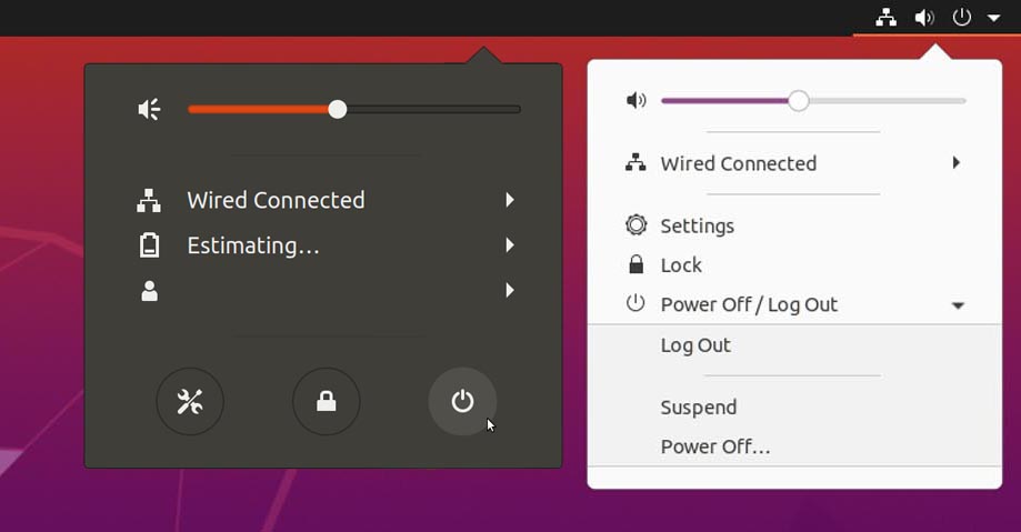
Very simple example: The power menu has been redesigned. Before that, click on the menu on the top right of the display, then on the shutdown icon. But since you couldn’t get a standby icon next to it (accessible via the Shift key, what logic!), You have now removed all icons (settings, locks and shutdown) and packed all of them in a kind of dropdown. So you go from the visually appealing icon principle to a text-based dropdown, where you need 4 clicks to shutdown a PC. That doesn’t sound like much, but it is a clear step back and more complicated than before. Instead of just adding a line below it, or thinking it through more carefully. Too bad.
Another point is that the included apps only come in a 6-month release. Windows and macOS have outsourced the apps from the main system so that they can be updated separately. This not only has major advantages in terms of safety, it also enables functions and corrections to be delivered to users faster. Perhaps the close interlocking is the problem, since the code base may not be ready yet because you are dependent on it. In the future, of course, that would be a welcome step.
More, in 2020 I cannot explain why my touchpad is so useless. I can scroll with two fingers or right click. Three or four fingers up, down, left, right. Nothing. I now find that more of a cheek, installing functions is not an option for many. Why is the touchscreen better supported than a touchpad? It’s really, really sad, I have to admit.
The notification center (also Windows / Superkey + M) now has a “do not disturb” switch. Otherwise, it remains in a somewhat helpful status, even if it is prettied up. Calendar entries and notifications are treated almost the same and look the same. Why? The monthly calendar is nice, but a little too general for everyday work, since the week is usually more important than a monthly overview. There is the calendar app anyway.
Personally, I tend to see the notifications on the left, a weekly calendar on the right, but it is less high and my next appointments are listed below – for today, if there is space tomorrow. With a button that opens the calendar app.
And if you install the weather app, the weather has been lined up for the next few hours – that’s nice, but temperatures and rough weather for the next few days should be more helpful. The location search is often inoperative, or shows locations twice and three times – then you can guess which works.
Apps
If you now open the launcher, one and a half pages of icons are available, with some somewhat questionable functions and programs. Although you can now (came a year or so ago) directly create folders in the launcher, it is questionable why Canonical does not use this to keep things tidy. So there is a folder with “Utilities” in which you can find the system monitor or a program for backups (as well as the calculator, which has little to do with the system itself), but there are updates, input methods and power statistics directly in the main overview.
Here, I’m sorry, there is an unplanned and illogical confusion. It is not that difficult to find out which apps and programs a normal user actually uses more often. ‘Live Patch’ and ‘Additional Drivers’ are not one of them. Some entries appear as if they should finally find their way into the system settings at some point. For others there are subfolders that should finally be used. Thank you!
At least it is good that you can now name folders. Again, it was rather surprising for me that the system automatically assigned names for folders in the previous version, depending on the content. Was that less effort than giving the user the opportunity to name their folders?
As usual, the package includes a selection of standard apps that provide basic functionality for daily tasks. These mostly adhere to the appearance and operation of the basic system, which is good. Often, the fact that these apps only develop very slowly and thus lack a lot of functionality is less good.
The file browser has a cumbersome way of dealing with network drives, it can only work with “bookmarks” and you have to mount and eject network drives every time – as is done with a USB stick. This basically makes no sense and unnecessarily complicates the daily use of network data. Why? Because you want to open the last file in LibreOffice as an example, which is in the network, but which can only be reached if you have mounted the network drive in the file browser. Additional software makes it possible, but is sad that it is necessary at all. A network drive is not a USB stick.
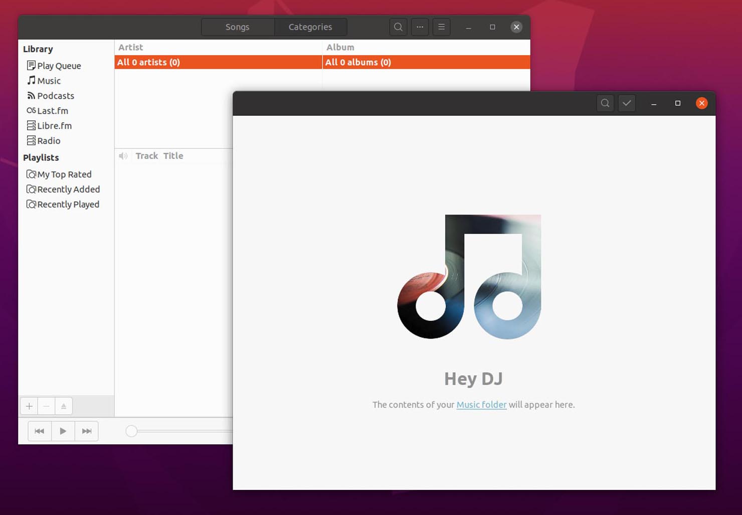
GNOME Music was supposed to be standard, but is not yet as good as the supplied Rythmbox. Liked the calendar app, it also offers almost everything you need for everyday work. The synch to Google should also work as an example. Images are opened with a small, brisk app, which is only capable of rotating images – more editing is not possible. This is a shame, especially in contrast to the competition, because photos and images are among the most popular files among the usual users. Whether they find and use the Shotwell program (and yes, the logo is a dead tree … at least in a photo frame) is another question. It is imperative to make up for it here, because the file masses of photos and videos in particular will not find their way into the cloud for a long time.
Webcam & scanning software is very useful if the hardware is supported. Also a nice ToDo app that is useful for working on the PC, a simple text editor that can also conveniently display many programming languages at least in color and supports tabs – there has apparently been more effort, even if many will never use the app. In web development, you also like to use a simple editor if you save snippets or take notes.
The video player is very good as long as you have installed the extras, as well as the calculator and the backup program. This controls all sorts of functions and settings in order to save everything without having to worry about it. System analysis apps are nice, but not outstanding. The GNOME app “Usage” is not yet good enough to replace the current one.
Of course there are more programs and apps that are included, so I mention the good screenshot app, which is not integrated into the system as an app. Since you can use the “Print” key on the keyboard to create a PNG of the display content, this is at least a good extra if you know it.
Overall, the package is round, if not too useful. However, if possible, a system should bring the basic functions with it today, as we are used to – even a cheap cell phone can easily edit photos. And to install any – often much more complicated – apps and programs for standard work tasks – unfortunately you can’t expect that from the normal user.
Firefox and Thunderbird are hardly worth mentioning because they are not only a working and current standard in the Linux world. Thunderbird is my mail program of choice, Firefox can of course also be exchanged for other browsers. For me, the GNOME browser, on the other hand, is a project that may need more prestige and work – because the other big ones also have it. Unfortunately a bit unnecessary these days.
Work
After weeks and months with Ubuntu, I can say that you can overlook a lot of things and it is clear that you do not want to constantly deal with the operating system, but with your work. Unfortunately, some things that are known from other systems are annoying, such as missing touchpad gestures, sometimes even a missing “click to minimize” on the dock. That you are often very dependent on other programs, even if you only want to reduce the size of a picture.
There are many good apps and programs that I also use as an expert, but which will never appeal to home users. Then you need tools that expand and change Ubuntu – so that weekdays are displayed at the top, as well as week numbers in the notification menu. Tools such as GNOME Tweaks and TLP (in the terminal) are required for the “click to minimize” on the dock, for touchpad gestures and longer laptop runtimes.
After all, you can at least change the theme in the settings, whereby a few more settings from the Tweak Tool would have been good and are also reasonable for the user. It takes more courage.
Unfortunately, many of the avoidable little helpers and apps from the store feel like half-baked burgers from the inn next door. Looks like a burger, but tastes kind of a burger, raw inside, without fries. But there is no other burger far and wide. Is that why he’s a good burger just because there’s nothing better?
Everyday work is good, I think. You usually use the browser, Thunderbird and LibreOffice, as well as GIMP or programs like Sublime Text, Inkscape or Filezilla. Audition or handbrake are also included. However, these are usually very good programs that run on multiple platforms and are actively developed.
In contrast to, for example, messenger apps, which were kindly packed into an app by someone, only the web version of it, but then do not run under Wayland. It just casts a shadow over the whole system and people are gone again. And that’s the shame about it.
WINE support for Windows programs is not exactly a hit either. People like to say “a lot works with WINE nowadays” and that is true. A lot has gone on there. Opening a simple EXE file with WINE – but that requires knowledge and nerves.
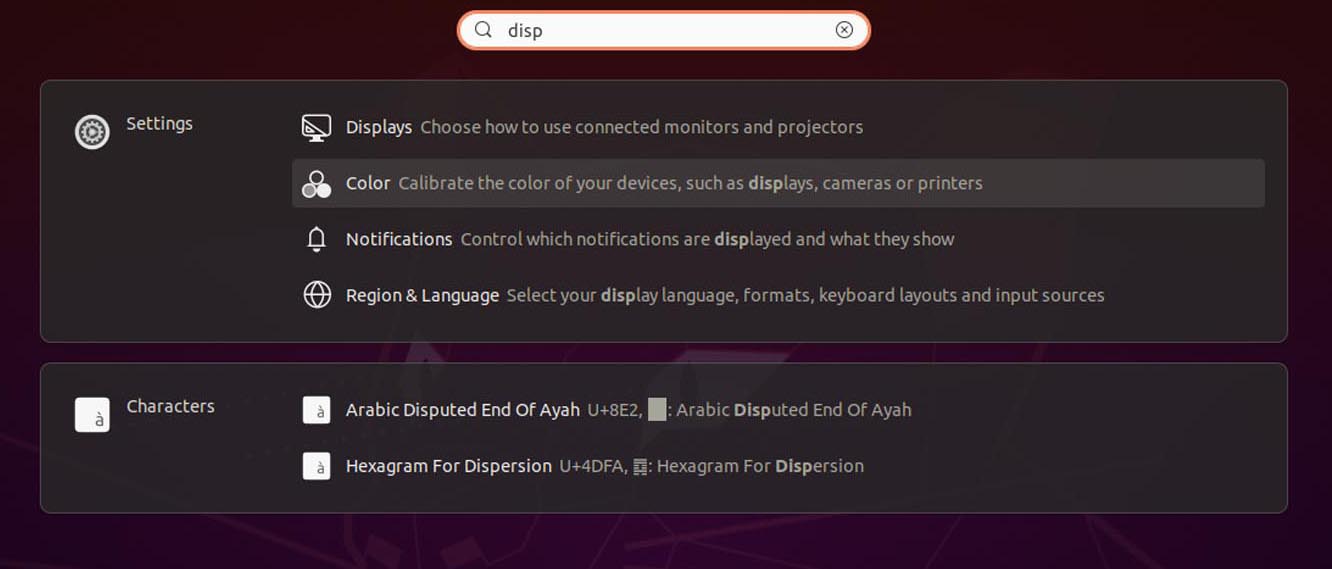
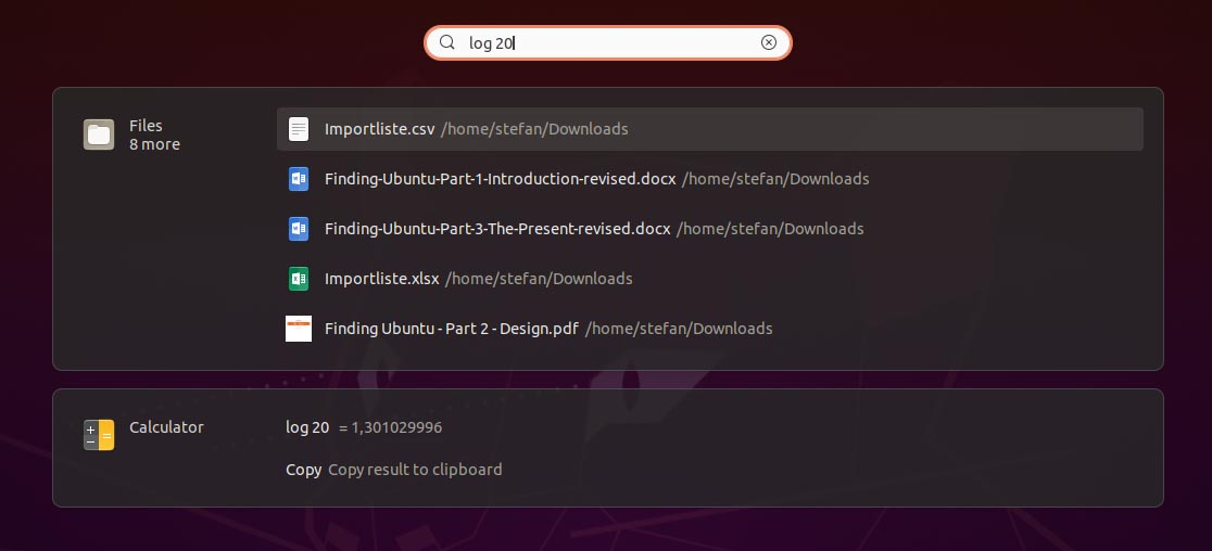
However, the search has become really annoying. This is annoying in everyday life, however, since I can no longer find my own files, of which I know what their names are. This looks like a mistake and will hopefully be corrected soon.
All in all, it is a shame that you will always find hurdles, even if often only small ones, that darkens the overall picture and everyday work.
I often ask myself: Do the developers also use the system to work, or do they only develop for it? Then the “do not disturb” mode might have been a bit lower on the list of priorities because I have never used it before. Or they work a little differently than many in everyday life, at GNOME’s.
And don’t get it wrong – you get along well in everyday life! But there is no good argument against the overwhelming quality of the competition, so I don’t want to pretend.
Games
Another important aspect is, of course, games, because they have long been part of society and a popular means of driving away rainy weekends. Or winter. A lot has happened here thanks to Steam and Proton, the player can often be expected to do more, which is why crafting is also a means that is at least possible.
The included mini-games run without a problem, games from the store like Super-Tux also work quite well, many of the free games are partly okay, but not of professional quality. And you don’t want to have to constantly compromise. But that has been changing for several years.
Steam is primarily a paid platform, so buying games, but that shouldn’t be the problem. The quality is usually right. There are also some games that run natively on Linux, for all others there is Proton. This is a kind of intermediate layer that translates Windows games to Linux. And that’s quite good.
Older test games like Banished work without anything, they also run very well. Anno 1404 – one of the standard games in my tests – only runs with a little manual work. In general, the development of the area has gone up extremely in recent years and – one would hardly believe it – Linux and Ubuntu could be a good alternative for gamers. Counter Strike Source, Cities Skylines, the multiple Tropico series, Transport Fever 1 + 2, Another Brick in the Mall … to name just a few games.
Conclusio
A lot has happened in the past two years. Ubuntu looks different, is faster and more useful, is more practical than ever and wonderfully usable for many.
Especially when it comes to tasks like surfing and emails, also office and development – no question. If you make friends with the peculiarities or lern something new, if necessary.
Unfortunately, version 20.04 also comes up with old problems, because a few moved buttons and small functions don’t bring you as much as a complete package. This is often done better in other distributions, even if only with baby steps. But often seemingly more consistent. This is generally because most of such projects are voluntary. But not Ubuntu and GNOME.
There is money behind and there are also a lot of hardworking people making the product better. But it feels like mistakes are often unsystematically rectified here because the overall structure seems inflexible and requires major changes:
Quote: “Vertical integration, which is very, very difficult”.
Mail from GNOME developer
So mostly it won’t be done. In larger companies there are also managers who take care of direction and strategy. If you can set up programmers that just help, why not managers, UX / UI people, designers and so on? Make a plan and start working.
Nevertheless, the system is easy to use, it is flexible and stable. Can do a lot and needs little. I find that very good and commendable, after all, Ubuntu is also the basis for several other systems.
That is still not enough for a real competition, I think the motivation is right. The speed and the way are not quite there yet. In the end, however, the system is recommended for beginners.
